
Most beginners do not need more indicators.
They need a cleaner decision process.
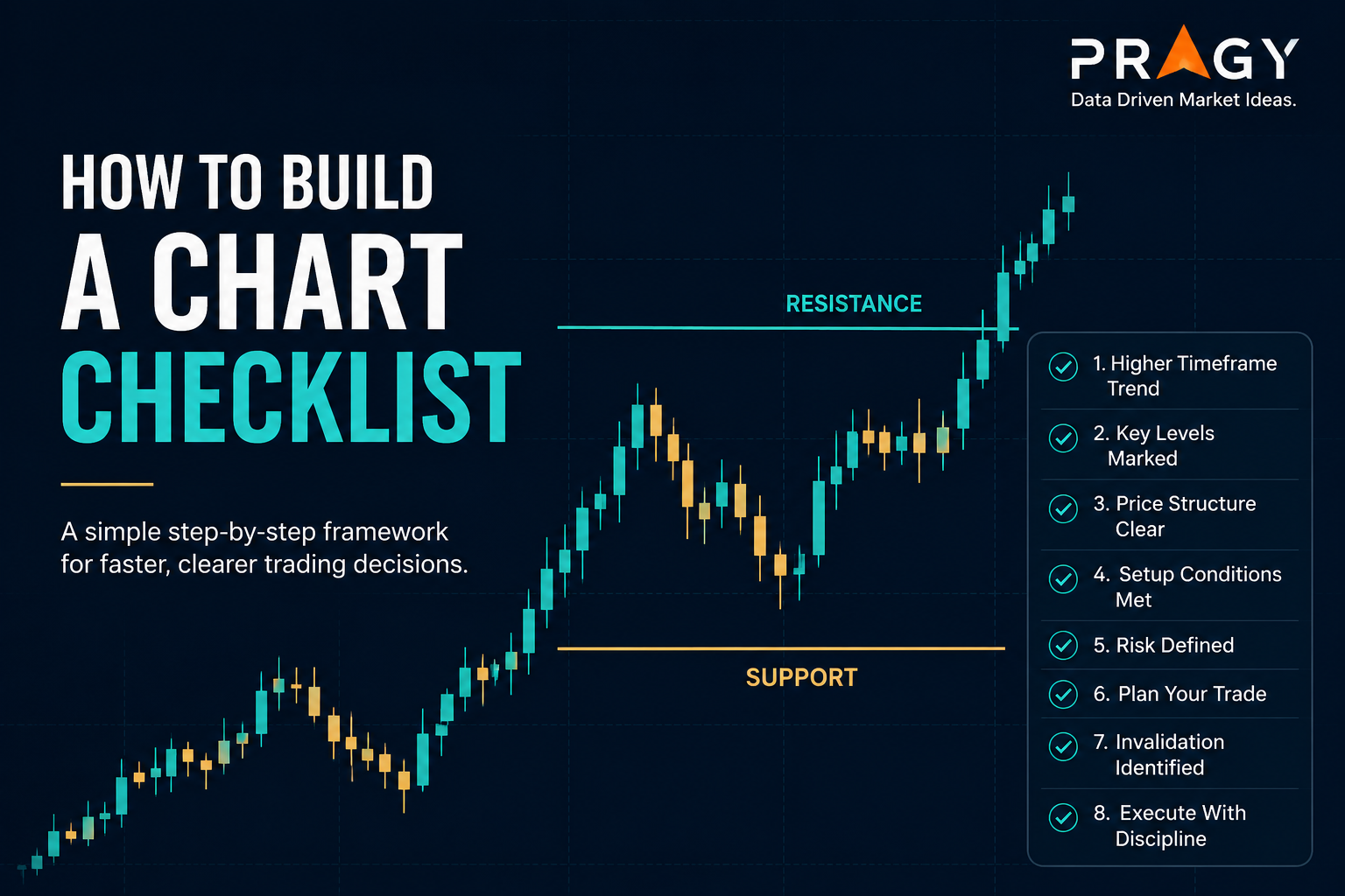
A chart checklist helps you slow down before clicking buttons. It forces you to ask the boring questions that matter: What is the trend? Where are the key levels? What would prove the idea wrong? How much risk is actually on the table?
Here’s the deal: a checklist will not make every setup work. That is not the job. The job is to keep you from making random decisions and then pretending they were “strategy.”
Here’s the simple version
A chart checklist is a repeatable set of questions you answer before considering a trade idea.
It should help you confirm five things:
- The bigger trend
- The important price levels
- The quality of the setup
- The risk plan
- The invalidation point
Invalidation means the price area where your trade idea is no longer valid. Not where your emotions get uncomfortable. Not where you “feel like giving it more room.” The level where the setup logically stops making sense.
Don’t overcomplicate it. A good checklist should fit on one page and be usable in under two minutes.
Why a chart checklist matters
Charts can trick you.
A green candle can make a weak setup look exciting. A red candle can make a normal pullback look terrifying. A pullback is a temporary move against the main trend. It can be healthy, or it can be the start of a breakdown. Context decides.
Without a checklist, you may jump between opinions:
“This looks strong.”
“Actually, maybe it is extended.”
“Wait, what if it breaks out?”
That is not analysis. That is chart anxiety with candlesticks.
A candlestick is a chart bar that shows the open, high, low, and close for a period of time. The candle body shows the open-to-close range. The wick is the thin line above or below the candle showing how far price moved before closing.
The clean version: your checklist turns chart reading into a sequence.
Step 1: Start with the higher timeframe
A higher timeframe means zooming out to see the bigger trend before making a smaller entry decision. For beginners, a clean starting point is using the daily chart for the big picture and the 1-hour chart to refine the setup.
Ask:
- Is price trending up, trending down, or moving sideways?
- Is the chart making higher highs and higher lows?
- Is the chart making lower highs and lower lows?
- Is price stuck in chop?
Chop is messy sideways price action where neither buyers nor sellers clearly control the move. Chop is where beginners often give back money because every candle looks important, but none of them really are.
Green flag: the higher timeframe is clear.
Red flag: you need to zoom in aggressively to make the setup look good.
Step 2: Mark support and resistance
Support is an area where buyers have previously stepped in. Resistance is an area where sellers have previously stepped in.
Do not draw twenty lines.
Mark the obvious levels only:
- Recent swing highs
- Recent swing lows
- Areas where price rejected multiple times
- Clean breakout or breakdown zones
A breakout happens when price moves above resistance or below support with enough strength to matter.
This is where people mess up: they treat every tiny pause as a major level. The more lines you draw, the less useful the chart becomes.
Your checklist question:
Is price near an important level, or am I forcing a setup in the middle of nowhere?
The middle of nowhere is usually where risk gets sloppy.
Step 3: Check the trend structure
Market structure means the basic pattern of price movement: higher highs, higher lows, lower highs, lower lows, or sideways ranges.
You do not need fancy language here.
Ask:
- Are buyers defending pullbacks?
- Are sellers rejecting rallies?
- Is price breaking levels and holding them?
- Is price breaking levels and immediately failing?
A simple moving average can help here. A moving average is a line that smooths price over a chosen number of periods, such as 20 candles or 50 candles. It does not predict the future. It helps you see trend direction more clearly.
A chart trading above a rising moving average may suggest stronger trend conditions. A chart trapped around a flat moving average may suggest chop.
Possible interpretation, not a rule: clean trend plus clean level is better than random candle excitement.
Step 4: Look at volume and volatility
Volume means the number of shares or contracts traded during a period. It can help show whether a move has participation behind it.
Volatility means how much price moves. High volatility can create opportunity, but it also increases risk. Low volatility can mean calm conditions, or it can mean the chart is not ready yet.
Checklist questions:
- Is volume increasing on the move?
- Is volume fading near the breakout?
- Are candles getting too large for clean risk management?
- Is the spread between entry and invalidation too wide?
The trap: confusing a big candle with a good setup.
A big candle after a long move can mean strength. It can also mean late buyers are chasing. Your checklist should slow you down long enough to ask which scenario fits the chart.
Step 5: Define the trade idea before the entry
Before thinking about execution, write the idea in one sentence.
Execution means the actual process of entering, managing, and exiting a trade based on the plan.
Example:
“Price is pulling back into prior resistance that may act as support while the higher timeframe remains in an uptrend.”
That is a trade idea.
This is not:
“Looks good.”
“Strong vibes.”
“Big candle.”
The trade idea should include the setup type:
- Breakout
- Pullback
- Support bounce
- Resistance rejection
- Trend continuation
- Range trade
A range trade means price is moving between support and resistance rather than trending clearly.
Step 6: Decide invalidation and stop loss
A stop loss is a planned exit level used to limit damage if the trade goes wrong.
Your invalidation point should come from the chart, not your pain tolerance.
Ask:
- What level would prove the setup wrong?
- Is that level obvious on the chart?
- Is the stop too tight because I want a bigger position?
- Is the stop too wide because I am entering late?
Red flag: moving the stop after entry because you “still believe in the idea.”
The chart does not care how much you believe.
Step 7: Check position sizing
Position sizing means deciding how much money to risk on one trade before entering.
A common beginner guardrail is risking about 1% to 2% of total account size on a single trade idea. For example, with a $5,000 account, 1% risk equals $50 of planned risk.
That does not mean buying $50 worth of stock. It means the planned loss between entry and stop loss equals $50 if the trade fails.
Simple example:
- Account size: $5,000
- Planned risk: 1%
- Dollar risk: $50
- Entry: $25
- Stop loss: $24
- Risk per share: $1
- Position size: 50 shares
The math is simple. The discipline is not.
Step 8: Check risk/reward
Risk/reward compares the amount you are risking to the possible reward.
If you risk $1 per share to potentially make $2 per share, that is a 1:2 risk/reward scenario.
Checklist questions:
- Is the next resistance too close?
- Is the next support too close?
- Is there enough room for the idea to work?
- Am I entering late after the easy part already happened?
This is where beginners often mess up. They find a strong-looking chart, enter near resistance, and then wonder why price stalls.
Strength matters. Location matters more.
Step 9: Review the market environment
A setup does not exist in a vacuum.
Before acting on a chart, check the broader environment:
- Is the overall market trending or choppy?
- Is the sector strong or weak?
- Is there major news or an earnings event nearby?
- Is the stock moving with the market or against it?
You do not need to become an economist. You just need to avoid analyzing one chart while ignoring the weather around it.
A great-looking setup in a messy market may need more caution. A decent setup aligned with a strong market may deserve more attention.
Again, not a recommendation. Just research context.
A practical chart checklist template
Use this as a starting framework.
1. Higher timeframe
- Daily chart trend is clear: yes / no
- Price is trending, ranging, or choppy
- Major support and resistance are marked
2. Setup quality
- Setup type is clear
- Price is near an important level
- Candles are readable, not chaotic
- Volume supports the possible scenario
3. Risk plan
- Entry area is defined
- Stop loss area is defined
- Invalidation level is clear
- Position size is calculated before entry
4. Risk/reward
- Target area is based on the chart
- Reward potential is reasonable compared with risk
- Setup is not directly into major support or resistance
5. Final decision
- Trade idea can be explained in one sentence
- No major event risk has been ignored
- The setup still makes sense after stepping away for one minute
The last point sounds silly. It is not.
Many bad trades fall apart after a 60-second pause.
Example: building a checklist decision
Let’s say a stock is in an uptrend on the daily chart.
Price breaks above resistance, then pulls back toward that same level. The prior resistance may now act as support. Volume increased on the breakout and cooled during the pullback. The invalidation level is just below the reclaimed support area.
Possible checklist read:
- Higher timeframe trend: up
- Setup type: pullback after breakout
- Key level: prior resistance acting as possible support
- Volume: stronger on breakout, quieter on pullback
- Invalidation: below reclaimed support
- Risk/reward: reasonable only if entry is close enough to support
- Decision: setup under observation, not automatic action
That last phrase matters: under observation.
A checklist does not force a trade. It tells you whether the idea is clean enough to keep studying.
Common mistakes beginners make
Mistake 1: Building a checklist with too many indicators
More indicators do not automatically create better decisions.
If your checklist has 14 tools, 9 confirmations, and 3 secret settings, you probably built a machine that explains confusion in high resolution.
Start simple.
Price. Trend. Levels. Volume. Risk.
Mistake 2: Treating the checklist like a guarantee
No checklist removes uncertainty.
A good setup can fail. A messy setup can work. The goal is not perfection. The goal is better decision quality over many examples.
The market does not reward you for sounding certain.
Mistake 3: Changing the checklist mid-trade
Your checklist is for planning before execution.
Once you are in the trade, changing the rules usually means emotion is taking over. Adjustments can be part of a strategy, but they need to be defined before the trade starts.
Mistake 4: Ignoring invalidation
If you cannot define where the idea is wrong, you do not have a complete setup.
You have a chart opinion.
That is weaker.
Mistake 5: Skipping screenshots and notes
Screenshot your setups.
Write down why you considered the idea. Later, review what happened. This creates feedback. Feedback creates improvement.
Without notes, every mistake feels new.
Action checklist
Before considering a chart setup, answer these questions:
- What is the higher timeframe trend?
- Where are the nearest support and resistance areas?
- Is the setup a breakout, pullback, bounce, rejection, or range idea?
- What would invalidate the setup?
- Where would the stop loss go?
- How much account risk is planned?
- Does the risk/reward make sense?
- Is volume helping or weakening the possible scenario?
- Is the broader market environment supportive or messy?
- Can the idea be explained in one clean sentence?
If you cannot answer these, the chart probably needs more work.
Final takeaway
A chart checklist is not about being fancy.
It is about removing avoidable nonsense from your decision process.
The best checklist is simple enough to use, strict enough to protect you, and practical enough to repeat. Trend. Levels. Setup. Risk. Invalidation. That is the foundation.
Don’t overcomplicate it.
Better chart reading starts with better questions.
Disclaimer
Educational content only. Not financial advice or a recommendation to buy, sell, or hold any security. Trading and investing involve risk, including possible loss of capital.