
Trendlines look simple.
That is exactly why beginners abuse them.
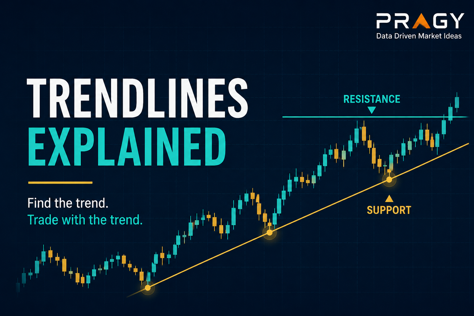
A trendline is just a diagonal guide drawn across a chart to help you see the direction of price. In an uptrend, traders often draw it under rising swing lows. In a downtrend, they often draw it above falling swing highs.
Sounds clean. Then reality shows up.
Two traders can look at the same chart and draw slightly different lines. One sees a clean trend. Another sees a broken setup. A third draws seventeen diagonal lines and calls it “analysis.”
Here’s the deal: trendlines are useful, but they are not magic. They are a visual tool, not a trading system by themselves.
Here’s the simple version
A trendline helps answer one basic question:
Is price respecting a direction, or is that direction starting to fail?
That is it.
An upward trendline connects higher swing lows. A swing low is a short-term low point where price stops falling and turns higher. When those lows keep forming higher than the previous lows, the chart may be showing upward structure.
A downward trendline connects lower swing highs. A swing high is a short-term high point where price stops rising and turns lower. When those highs keep forming lower than the previous highs, the chart may be showing downward structure.
The clean version:
- Uptrend line: connects rising lows.
- Downtrend line: connects falling highs.
- Sideways market: trendlines usually get messy fast.
Don’t overcomplicate it.
What a trendline actually tells you
A trendline does not predict the future.
It gives you a reference point.
If price keeps reacting near the line, that tells you the market is still respecting that slope. If price slices through the line and cannot recover it, that may suggest momentum is changing.
Think of it like a guardrail.
Not a brick wall. Not a guarantee. A guardrail.
Price can briefly move through a trendline, create a wick, and then recover. A wick is the thin line above or below a candlestick showing how far price moved before closing. This is why beginners should avoid treating trendlines like exact laser beams.
Charts are messy. Use trendlines as zones, not sacred geometry.
The three-touch rule
A trendline usually becomes more meaningful after price touches or reacts near it multiple times.
Two touches can define a possible line.
Three touches can make it more interesting.
But be careful. If you force the chart to fit the line, the line is not helping you. You are just decorating the chart.
A cleaner trendline usually has:
- A clear first swing point.
- A clear second swing point.
- A third reaction that confirms price is noticing the area.
The trap is drawing the line after the move is already obvious and pretending it gave you advance warning.
Trendlines should help you organize price action. They should not become an excuse to chase.
Use the higher timeframe first
A higher timeframe means zooming out to see the bigger trend before making a smaller entry decision. For beginners, a clean starting point is using the daily chart for the big picture and the 1-hour chart to refine the setup.
Why does this matter?
Because a trendline on a 5-minute chart may look dramatic while the daily chart is still stuck in chop. Chop is messy sideways price action where neither buyers nor sellers clearly control the move.
This is where people mess up.
They draw a perfect short-term trendline, ignore the bigger chart, and then act surprised when the setup fails inside a larger sideways range.
Start with the bigger picture:
- Is the broader trend up, down, or sideways?
- Is price near support or resistance?
- Is volatility expanding or shrinking?
Support is an area where buyers have previously stepped in. Resistance is an area where sellers have previously stepped in. Volatility means how much and how quickly price moves.
A trendline becomes more useful when it agrees with the bigger market structure.
How to draw an upward trendline
For an uptrend, start by finding two obvious higher swing lows.
Draw the line underneath them.
Then extend the line to the right.
The goal is not to touch every candle perfectly. The goal is to capture the general slope of demand.
A cleaner upward trendline often has price pulling back toward it, reacting, and then continuing higher. A pullback is a temporary move against the main trend.
Green flag: price pulls back calmly, respects the trendline area, and then shows renewed strength.
Red flag: price falls sharply through the line, struggles to reclaim it, and starts making lower highs.
That does not automatically mean a trade should be taken. It means the behavior has changed.
How to draw a downward trendline
For a downtrend, find two obvious lower swing highs.
Draw the line above them.
Then extend the line to the right.
A downward trendline can help show where sellers have been stepping in. If price keeps rejecting near that line, the downtrend may still be intact.
But again, it is a guide.
A breakout happens when price moves above resistance or below support with enough strength to matter. A break above a downward trendline can be interesting, but beginners should be careful with the first break.
Some breaks fail.
Some breaks turn into chop.
Some breaks need volume confirmation. Volume means the number of shares or contracts traded during a period. Higher volume can sometimes show stronger participation, but it should be used as context, not as a guaranteed signal.
Trendline breaks: what actually matters
A trendline break is not automatically important.
The better question is:
What happens after the break?
A weak break that immediately reverses may not tell you much. A cleaner shift often has more evidence:
- Price breaks the trendline.
- Price retests the area.
- Price holds above it in an upside break, or below it in a downside break.
- The chart starts making a new structure.
A retest means price comes back to check the broken area. Sometimes old resistance can become support. Sometimes old support can become resistance.
But no single pattern guarantees anything.
The practical idea is to look for confirmation, not perfection.
A practical beginner framework
Here is a simple way to study trendlines without turning them into fortune-telling tools.
Step 1: Start with market structure
Ask whether price is making higher highs and higher lows, lower highs and lower lows, or moving sideways.
Market structure means the basic pattern of price swings. It is the skeleton of the chart.
If structure is unclear, the trendline probably will be unclear too.
Step 2: Draw only the obvious line
Use the cleanest swing points.
Do not force the line through random candle bodies just to make the chart look smarter.
A good trendline should be easy to explain in one sentence.
Example:
“Price has reacted near this rising line three times while making higher lows.”
That is useful.
“Price touched this diagonal line if I adjust it slightly and ignore that one candle and switch timeframes twice.”
That is a warning sign.
Step 3: Define invalidation
Invalidation is the price level or area where the trade idea is no longer valid.
For educational planning, the trendline can help you think about invalidation. If the idea depends on price respecting an upward trendline, then a strong break below the line may weaken the idea.
This does not mean the line is a perfect stop level. It means it can help define where the story changes.
A stop loss is a planned exit level used to limit damage if the trade goes wrong. Beginners should understand the concept before placing real trades.
Step 4: Think in risk, not hope
Position sizing means deciding how much money to risk on one trade before entering.
A common beginner guardrail is risking about 1% to 2% of total account size on a single trade idea. For example, with a $5,000 account, 1% risk equals $50 of planned risk.
Risk/reward compares the possible risk on a trade idea with the possible reward. If the chart only offers a tiny potential reward while requiring a large loss if wrong, the setup may not be worth forcing.
Trendlines should support a risk framework.
They should not replace one.
Example: studying an uptrend pullback
Imagine a stock has been moving higher for several weeks.
On the daily chart, price is making higher highs and higher lows. You draw a rising trendline under the last two major swing lows. A few days later, price pulls back toward the line for a third test.
An educational way to study the setup:
- The higher timeframe is still showing an uptrend.
- Price is pulling back toward a clear rising trendline.
- The trendline area is close to a previous support zone.
- Volume is calmer during the pullback.
- You define the area where the idea would be invalidated.
- You calculate planned risk before thinking about potential reward.
Notice what is missing.
No prediction.
No “this must bounce.”
No pretending the line controls the market.
The trendline simply organizes the decision.
Common mistakes with trendlines
Mistake 1: Drawing too many lines
If your chart looks like a spider web, the trendline is no longer helping.
One clean line is usually better than seven questionable ones.
Mistake 2: Forcing the line to fit your bias
The market does not care about your line.
If you keep adjusting the trendline to defend an idea, the chart may be telling you something you do not want to hear.
Mistake 3: Treating every break as a major signal
Trendlines break all the time, especially on lower timeframes.
A break matters more when it changes structure, holds on a retest, or lines up with support, resistance, volume, and the higher timeframe.
Mistake 4: Ignoring sideways markets
Trendlines work best when a market is actually trending.
In chop, diagonal lines can create false confidence. Sideways markets often respect horizontal support and resistance more cleanly than trendlines.
Mistake 5: Forgetting risk management
A trendline is not a risk plan.
Before studying any setup, define invalidation, planned risk, and position size. The line can help with structure, but it cannot protect capital by itself.
Action checklist
Before using a trendline in your chart review, run this checklist:
- Is the market actually trending?
- Did I start with the higher timeframe?
- Am I connecting obvious swing points?
- Does the line have at least two clear touches and a possible third reaction?
- Am I treating the line as a zone, not an exact price?
- Does the trendline align with support, resistance, or structure?
- What would invalidate the idea?
- Have I planned risk before thinking about reward?
- Am I using the trendline to clarify the chart, or to justify a bias?
The last question is the big one.
Final takeaway
Trendlines are useful when they simplify the chart.
They are dangerous when they make you feel certain.
The best use of a trendline is not prediction. It is structure. It helps you see whether price is respecting a trend, losing momentum, or shifting behavior.
Draw fewer lines. Use bigger timeframes. Respect invalidation. Plan risk first.
The clean version: a trendline is a guide, not a guarantee.
Disclaimer
Educational content only. Not personalized financial advice. Not a recommendation to buy, sell, or hold any security. Trading and investing involve risk, and loss of capital is possible.