
Candlestick charts look intimidating at first.
Green candles. Red candles. Wicks. Bodies. Patterns with names that sound like they escaped from a martial arts movie.
Here’s the deal: a candlestick chart is not magic. It is just a clean way to see what price did during a specific period of time.
Once you understand the parts of a candle, you can start reading the story behind price movement instead of staring at random red and green blocks.
Here’s the simple version
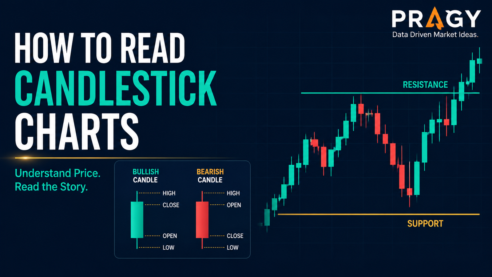
A candlestick shows four prices for one time period:
- Open: where price started during that candle.
- High: the highest price reached.
- Low: the lowest price reached.
- Close: where price finished.
That is it.
A candle on a daily chart shows one day of price action. A candle on a 1-hour chart shows one hour. A candle on a 5-minute chart shows five minutes.
The clean version: each candle answers one question.
Who had more control during that period: buyers, sellers, or nobody?
The anatomy of a candlestick
A candlestick has two main parts: the body and the wick.
The body is the thick part of the candle. It shows the distance between the open and the close.
The wick is the thin line above or below a candlestick showing how far price moved before closing.
A candle usually has:
Body
The body shows where price opened and closed.
If the candle closes above where it opened, it is commonly shown as green or white. That means buyers pushed price higher during that period.
If the candle closes below where it opened, it is commonly shown as red or black. That means sellers pushed price lower during that period.
Upper wick
The upper wick shows how high price went before pulling back.
A long upper wick can mean buyers tried to push higher, but sellers rejected the move before the candle closed.
Lower wick
The lower wick shows how low price went before bouncing.
A long lower wick can mean sellers pushed price down, but buyers stepped in before the candle closed.
High and low
The highest point of the wick is the candle high. The lowest point is the candle low.
Simple. Useful. Not mystical.
Green candles and red candles are not enough
This is where people mess up.
They see a green candle and think, “Good.” They see a red candle and think, “Bad.”
That is beginner chart reading, but it is incomplete.
A green candle at resistance may be losing strength. A red candle into support may be near exhaustion.
Support is an area where buyers have previously stepped in. Resistance is an area where sellers have previously stepped in.
Candles only make sense when you read them in context.
Ask:
- Where is this candle forming?
- Is it near support or resistance?
- Is it part of a trend or stuck in chop?
- Did volume expand or fade?
- Is the candle closing strong or leaving a big wick?
Chop is messy sideways price action where neither buyers nor sellers clearly control the move.
One candle can give a clue. A group of candles gives context.
The four candle stories beginners should know
Do not overcomplicate it. Most candles tell one of four basic stories.
1. Strong bullish candle
A strong bullish candle has a large body and closes near its high.
That tells you buyers controlled most of the period.
Green flag: the candle breaks above a key area and closes strong.
Red flag: the candle looks strong but appears after a huge extended move with weak follow-through.
2. Strong bearish candle
A strong bearish candle has a large body and closes near its low.
That tells you sellers controlled most of the period.
This can matter when price breaks below support or rejects a resistance zone.
But again, one candle is not a complete plan.
3. Rejection candle
A rejection candle has a long wick and a smaller body.
A long lower wick means price pushed down, then recovered. Buyers defended the area.
A long upper wick means price pushed up, then got rejected. Sellers defended the area.
The trap: beginners often treat every wick like a reversal signal. It is not. A wick matters more when it forms at an important level.
4. Indecision candle
An indecision candle has a small body and wicks on both sides.
It means price moved around but closed near where it opened.
Neither side clearly won.
That does not automatically mean a reversal is coming. Sometimes it means the market is pausing. Sometimes it means the chart is noisy. Sometimes it means nothing useful yet.
Timeframe matters more than beginners think
A higher timeframe means zooming out to see the bigger trend before making a smaller entry decision. For beginners, a clean starting point is using the daily chart for the big picture and the 1-hour chart to refine the setup.
Why does this matter?
Because a candle can look dramatic on a 5-minute chart and barely matter on a daily chart.
A big red 5-minute candle might just be a tiny pullback inside a strong daily uptrend.
A pullback is a temporary move against the main trend.
Before reacting to a candle, zoom out.
Ask:
- What is the daily trend doing?
- Is price making higher highs and higher lows?
- Is price making lower highs and lower lows?
- Are candles forming near a major support or resistance area?
This is how you avoid getting bullied by tiny candles.
Read candle closes, not just candle movement
The close matters.
A candle can spike above resistance during the session and still close back below it. That is very different from a candle that breaks above resistance and closes firmly above it.
A breakout happens when price moves above resistance or below support with enough strength to matter.
The closing price helps you judge whether the breakout had follow-through or whether it was just a failed push.
Clean beginner rule: do not get overly excited by a candle before it closes.
An unfinished candle can look powerful, then completely change before the period ends.
Volume adds another layer
Volume means how many shares or contracts traded during a period.
Volume does not guarantee anything, but it helps you judge participation.
A breakout on higher volume may suggest stronger interest behind the move. A breakout on weak volume may be more fragile.
A rejection candle on high volume can show a serious battle between buyers and sellers. A tiny candle on low volume may not deserve much attention.
Use volume as supporting evidence, not as a crystal ball.
Volatility changes candle size
Volatility means how much price moves over a period of time.
High-volatility stocks can produce large candles often. Low-volatility stocks may move in smaller, slower candles.
That means you should not judge every candle by size alone.
A large candle in a quiet stock may be meaningful. A large candle in a wild stock may be normal.
Context wins again.
Moving averages can help with trend context
A moving average is a line that smooths price over a selected number of periods.
For example, a 20-day moving average shows the average closing price over the last 20 trading days.
Moving averages can help beginners see trend direction without getting lost in every candle.
If price is above a rising moving average, the trend may be healthier. If price is below a falling moving average, sellers may have more control.
But do not turn moving averages into magic lines. They are tools, not guarantees.
Practical example: reading a candle at support
Imagine a stock has been pulling back toward a support area around $50.
Price dips below $50 during the day, but then closes back above $50 with a long lower wick.
What does that suggest?
Possible interpretation: sellers pushed price lower, but buyers stepped in before the close.
That does not mean the stock must go higher. It means the support area is worth observing.
A beginner-friendly framework:
- Identify the level.
- Wait for the candle to close.
- Check whether the wick shows rejection.
- Look at volume.
- Zoom out to the higher timeframe.
- Define invalidation before considering any trade idea.
Invalidation is the price level or area where the trade idea is no longer valid.
For example, if the idea depends on price holding above support, a clean close below that support area may invalidate the setup.
Candlestick charts are not trading plans
A candle can help you read price action. It cannot manage risk for you.
A stop loss is a planned exit level used to limit damage if the trade goes wrong.
Position sizing means deciding how much money to risk on one trade before entering. A common beginner guardrail is risking about 1% to 2% of total account size on a single trade idea. For example, with a $5,000 account, 1% risk equals $50 of planned risk.
That does not make a trade safe. It creates a boundary.
A chart setup without risk planning is just a guess wearing a nice outfit.
Common mistakes when reading candlestick charts
Mistake 1: Memorizing patterns without context
Hammer. Doji. Engulfing candle. Shooting star.
The names are less important than the story.
Where did the candle form? What level is nearby? What was the trend before it? Did the candle close strongly?
Context beats pattern memorization.
Mistake 2: Treating every candle like a signal
Not every candle matters.
Many candles are just noise, especially in sideways markets.
Red flag: making a new decision after every single candle.
Green flag: waiting for candles at important areas.
Mistake 3: Ignoring the higher timeframe
A bullish candle on a small timeframe can form inside a major downtrend.
A bearish candle on a small timeframe can form inside a healthy pullback.
Zoom out before zooming in.
Mistake 4: Forgetting risk
A beautiful candle can still fail.
The market does not owe you follow-through.
Before acting on any setup, know the risk, the invalidation area, and the position size.
Mistake 5: Reading candles in isolation
Candles are part of a chart. The chart is part of a market. The market is part of a broader environment.
You do not need to analyze everything. But you do need more than one candle.
Action checklist: how to read a candlestick chart
Use this simple checklist before making sense of a candle:
- What timeframe am I viewing?
- Did the candle close bullish, bearish, or neutral?
- Is the body large or small?
- Are the wicks showing rejection?
- Is the candle forming near support or resistance?
- Is the broader trend up, down, or sideways?
- Is volume confirming or fading?
- Is the chart clean, or is it stuck in chop?
- What would invalidate the idea?
- How would risk be controlled?
This checklist slows you down in a good way.
The goal is not to predict every candle. The goal is to read price action with discipline.
Final takeaway
Candlestick charts are useful because they turn price movement into a visual story.
The body shows the battle between open and close. The wick shows the failed push. The close shows who finished stronger.
But candles are only clues.
The best beginners learn to combine candles with support, resistance, trend, volume, timeframe, and risk.
Don’t overcomplicate it.
Read the candle. Read the level. Read the trend. Define the risk.
That is the foundation.
Disclaimer
Educational content only. Not personalized investing or trading advice. Not a recommendation to buy, sell, or hold any security. Trading and investing involve risk, and loss of capital is possible.