
Most traders do not lose because they cannot find a chart pattern.
They lose because they find a chart pattern in the wrong context.
A five-minute breakout looks exciting until the daily chart is sitting under heavy resistance. A clean pullback looks tempting until the weekly trend is rolling over. A stock may look strong on one screen and messy on another.
That is where multi-timeframe analysis helps.
It is not magic. It is not a secret indicator. It is simply the habit of checking the bigger chart before making a smaller decision.
Here’s the deal: the smaller timeframe gives you detail. The bigger timeframe gives you context. You need both.
Here’s the simple version
Multi-timeframe analysis means using more than one chart timeframe to understand price.
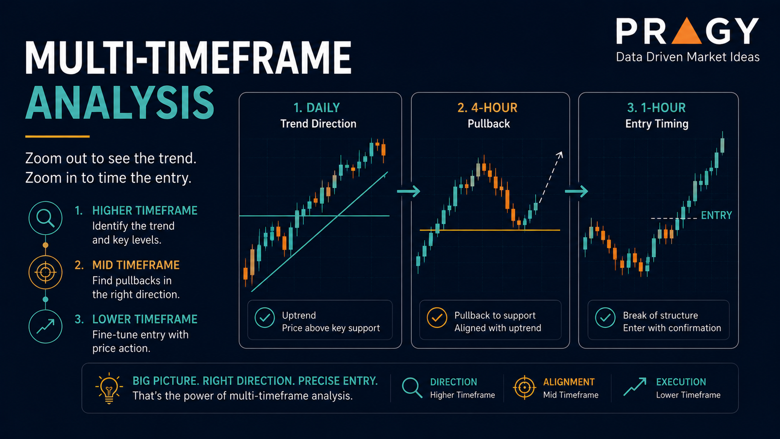
A higher timeframe means zooming out to see the bigger trend before making a smaller entry decision. For beginners, a clean starting point is using the daily chart for the big picture and the 1-hour chart to refine the setup.
The clean version:
- Use the higher timeframe to define the trend and key levels.
- Use the lower timeframe to study timing and execution.
- Avoid taking a lower-timeframe setup that directly fights the higher-timeframe structure.
- Plan invalidation before entering.
Invalidation is the price level or area where the trade idea is no longer valid. If price reaches that area, the original setup has failed.
Don’t overcomplicate it. Multi-timeframe analysis is not about staring at seven screens. It is about asking one better question:
Does the smaller setup agree with the bigger chart?
Why one timeframe can trick you
Every timeframe tells a different part of the story.
A one-minute chart can make normal noise look dramatic. A weekly chart can make a sharp intraday move look irrelevant. Neither is “wrong.” They are just showing different levels of detail.
The trap is treating a small chart like it explains the whole market.
A stock can look like it is breaking out on a 15-minute chart while the daily chart is still trapped under resistance. Resistance is an area where sellers have previously stepped in. Price can break a minor intraday level and still run into a bigger overhead level that matters more.
This is where people mess up. They see movement and confuse it with meaningful progress.
A better approach is to stack the evidence:
- What is the bigger trend?
- Where are the major support and resistance zones?
- Is price extended or resting?
- Is the lower timeframe setting up with or against the larger structure?
Support is an area where buyers have previously stepped in. Support and resistance are not exact magic lines. They are zones where market participants have reacted before.
The three-timeframe framework
You can use many combinations, but beginners should keep the structure simple.
A clean framework is:
1. The bias timeframe
This is the bigger chart used to understand direction and context.
For active traders, the daily chart often works well. It helps answer:
- Is price trending up, trending down, or chopping sideways?
- Is price near major support or resistance?
- Is the stock showing relative strength or weakness?
- Is the setup happening near a clean level or in the middle of nowhere?
Chop is messy sideways price action where neither buyers nor sellers clearly control the move.
The bias timeframe does not tell you exactly where to act. It tells you whether the environment is worth studying.
2. The setup timeframe
This is where the trade idea starts to take shape.
For many active traders, the 1-hour chart or 30-minute chart can show cleaner structure than the tiny intraday charts. You may look for:
- A pullback into a key area
- A breakout attempt from a clean range
- A higher low forming above support
- A rejection from resistance
- A trendline break
- A moving average reclaim
A pullback is a temporary move against the main trend. A breakout happens when price moves above resistance or below support with enough strength to matter. A moving average is a line that smooths price over a selected period so the trend is easier to see.
The setup timeframe connects the big picture to a possible plan.
3. The execution timeframe
This is the smaller chart used to refine timing.
Execution means the actual process of entering, managing, and exiting a trade according to a plan.
Some active traders use the 15-minute, 5-minute, or even smaller charts for execution. Beginners should be careful here. Smaller charts move faster and create more false signals.
On the execution timeframe, you are looking for details such as:
- Does price hold the level after testing it?
- Are candles closing above or below the area?
- Is volume expanding or drying up?
- Where would the idea be invalidated?
- Is the planned risk reasonable?
A candlestick is one price bar showing the open, high, low, and close for a selected time period. A wick is the thin line above or below a candlestick showing how far price moved before closing. Wicks can help show rejection, especially around key levels.
Volume measures how many shares or contracts traded during a period. Volatility describes how much price is moving. High volatility can create opportunity, but it can also make poor position sizing painful.
A practical example
Imagine a stock is trending higher on the daily chart.
It has been making higher highs and higher lows. Price pulls back toward a prior breakout zone that may now act as support. The daily chart does not scream “perfect trade.” It simply says the bigger structure is still constructive.
Now zoom into the 1-hour chart.
You see price slowing down near that support zone. Sellers push it lower, but the candles keep closing back above the level. That suggests the area is being defended.
Now zoom into the 15-minute chart.
Price forms a small range above support. It breaks above the range, then pulls back and holds the breakout area. The plan may become clearer:
- Bigger trend: up
- Key area: daily support
- Setup: 1-hour stabilization
- Execution: 15-minute range reclaim
- Invalidation: below the support zone
- Risk: defined before entry
That last part matters.
A stop loss is a planned exit level used to limit damage if the trade goes wrong. It is not a guarantee. Fast markets, gaps, and poor liquidity can create worse exits than expected. But having a plan is still better than improvising under stress.
Position sizing means deciding how much money to risk on one trade before entering. A common beginner guardrail is risking about 1% to 2% of total account size on a single trade idea. For example, with a $5,000 account, 1% risk equals $50 of planned risk.
That does not mean risking 1% to 2% is perfect for everyone. It is a simple educational guardrail that helps beginners stop thinking only about entry and start thinking about damage control.
The clean checklist
Before acting on a lower-timeframe setup, ask:
What does the higher timeframe say?
Green flag: the lower-timeframe idea aligns with the bigger trend or a major level.
Red flag: the lower-timeframe setup is pushing straight into higher-timeframe resistance.
Where is the major level?
Green flag: the plan is built around a clear support or resistance zone.
Red flag: the setup is floating in the middle of a messy range.
Is price extended?
Green flag: price has pulled back, reset, or built a base.
Red flag: price has already moved too far too fast and the setup is late.
What proves the idea wrong?
Green flag: invalidation is clear and nearby enough for controlled risk.
Red flag: the stop area is vague, emotional, or so far away that the trade no longer makes sense.
Is the smaller chart clean or noisy?
Green flag: candles are respecting levels and structure is readable.
Red flag: the chart is full of random spikes, failed moves, and chop.
Common mistakes
Mistake 1: Using too many timeframes
More charts do not always mean better analysis.
Checking the monthly, weekly, daily, 4-hour, 1-hour, 15-minute, 5-minute, and 1-minute chart can create analysis soup. You can always find one timeframe that supports the story you want to believe.
The fix: start with two or three.
For example:
- Swing trading education: weekly, daily, 1-hour
- Active trading education: daily, 1-hour, 15-minute
- Intraday trading education: 1-hour, 15-minute, 5-minute
The exact combination matters less than consistency.
Mistake 2: Letting the small chart override the big chart
A tiny breakout can look impressive in isolation.
But if it is happening directly below a major daily resistance zone, the setup may have a tougher path. That does not mean price cannot continue. Markets can do anything. It means the trader should recognize the friction.
The bigger chart usually carries more weight.
Mistake 3: Ignoring invalidation
Beginners often ask, “Where can this go?”
The better first question is, “Where am I wrong?”
If you cannot define invalidation, you do not have a structured idea. You have a hope with candlesticks attached.
Mistake 4: Chasing after confirmation
Waiting for confirmation is smart. Chasing after every candle is not.
A strong candle above a level can show interest. But entering after a huge move may create poor risk/reward.
Risk/reward compares the planned risk on an idea with the possible reward. For example, risking $1 to potentially make $2 is a 1:2 risk/reward framework. It does not guarantee the outcome. It simply helps you judge whether the setup is worth studying.
Mistake 5: Forgetting market context
A stock can have a clean setup, but the broader market can still be unstable.
For Pragy Investments, the focus is U.S. and Canadian stocks, and active traders often compare individual names against broader market context. That may include major indexes, sector movement, relative strength, liquidity, and volatility.
Liquidity means how easily something trades without large price disruption. Thin liquidity can make entries and exits harder, especially for active traders.
A simple beginner workflow
Here is a practical way to use multi-timeframe analysis without turning your brain into spaghetti.
Step 1: Start with the daily chart
Mark the obvious trend, support, and resistance.
Do not draw twelve lines. Mark the levels that actually stand out.
Step 2: Decide the context
Ask whether price is trending, ranging, breaking out, pulling back, or chopping.
This is your market condition.
Step 3: Drop to the 1-hour chart
Look for a setup forming near a meaningful area.
You are not trying to predict every candle. You are looking for structure.
Step 4: Use the smaller chart only for timing
The smaller chart should refine the plan, not create a completely new one.
If the 15-minute chart looks exciting but the daily chart looks terrible, pause.
Step 5: Define the risk before the entry
Set the invalidation area. Estimate the planned risk. Decide whether the idea still makes sense.
The trap is falling in love with the setup before measuring the downside.
Action checklist
Before studying a trade idea, run through this:
- Identify the higher-timeframe trend.
- Mark major support and resistance.
- Decide whether price is trending, pulling back, breaking out, or chopping.
- Use the middle timeframe to find structure.
- Use the lower timeframe only to refine timing.
- Define invalidation before entry.
- Check whether position sizing keeps the risk controlled.
- Avoid setups that fight obvious higher-timeframe resistance or support.
- Skip the idea when the chart is too messy to explain simply.
If you cannot explain the setup in two sentences, the chart may not be clean enough.
Final takeaway
Multi-timeframe analysis is not about making trading complicated.
It is about stopping the small chart from tricking you.
The higher timeframe gives you the map. The lower timeframe gives you the turn-by-turn directions. When they agree, the idea is easier to study. When they conflict, caution goes up.
The clean version: zoom out first, refine second, execute only with a plan.
Don’t overcomplicate it.
Disclaimer
Educational content only. Not financial advice, not personalized investment advice, and not a recommendation to buy, sell, or hold any security. Trading and investing involve risk, and loss of capital is possible.