
Most traders look at a chart and ask, “Is this moving up or down?”
Better question: Is this moving better or worse than the market around it?
That is the idea behind relative strength and relative weakness. You are not just judging price in isolation. You are comparing behavior.
Because here’s the deal: a stock can look “fine” on its own chart and still be a laggard. Another stock can look quiet for a few sessions and still be quietly leading its group. Context changes the read.
This article breaks down the clean version for active traders: what relative strength means, what relative weakness means, how to compare them, and where beginners usually get trapped.
Here’s the simple version
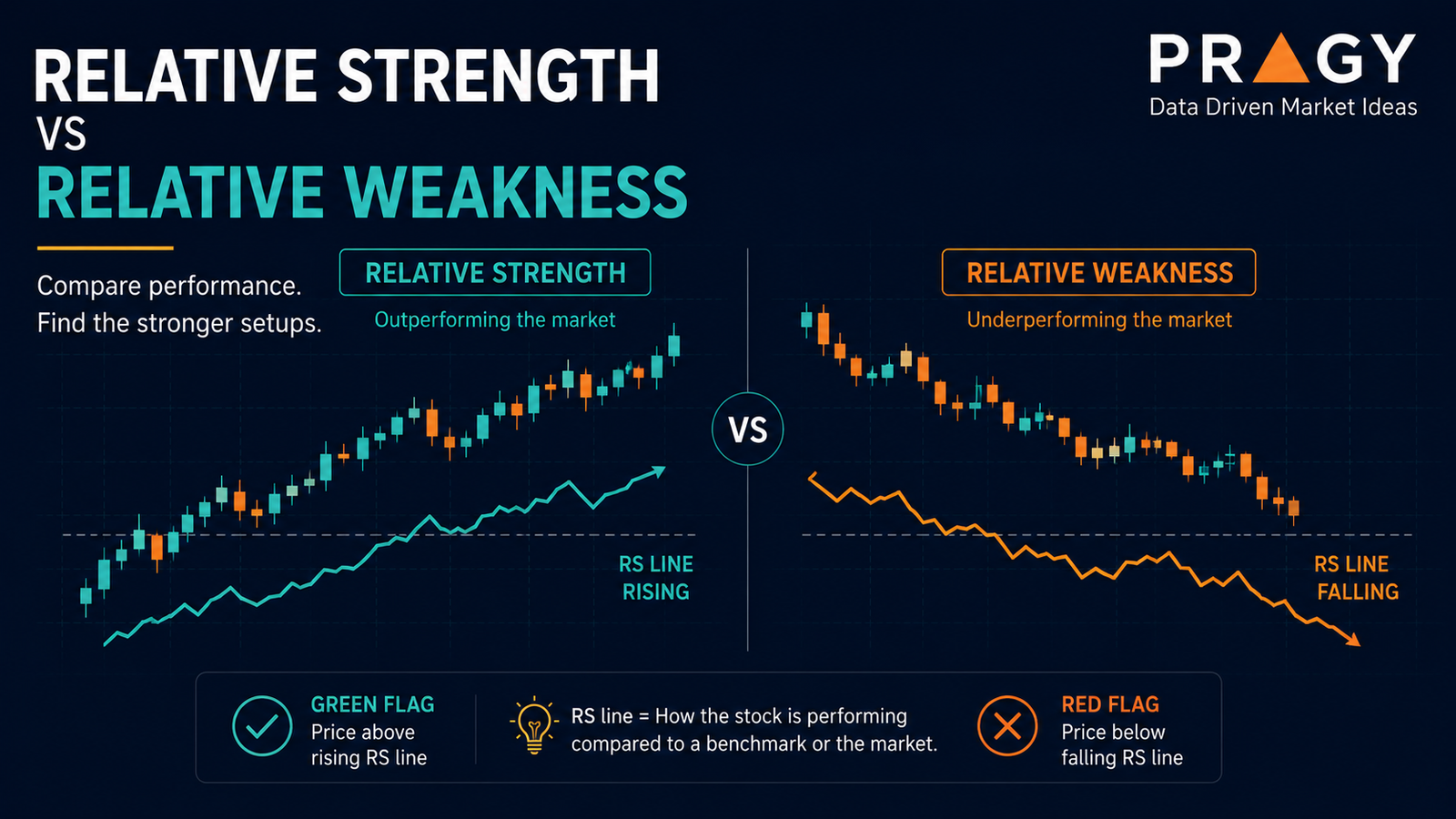
Relative strength means an asset is performing better than a comparison point, such as the broader market, its sector, or a peer group.
Relative weakness means an asset is performing worse than that comparison point.
That comparison point is called a benchmark. A benchmark is the reference you use to judge performance. For U.S. stocks, traders often compare against broad market indexes, sector ETFs, or direct industry peers. For Canadian stocks, the same idea applies using a relevant Canadian index, sector group, or peer basket.
The clean version:
- If the market is flat and a stock is pushing higher, that is relative strength.
- If the market is bouncing and a stock cannot lift, that is relative weakness.
- If the sector is strong but one name is breaking down, that lag matters.
- If the sector is weak but one name is holding support, that leadership matters.
Don’t overcomplicate it. You are asking one practical question:
Is this asset leading, lagging, or moving with the crowd?
Relative strength is not the same as RSI
This is where people mess up.
The term relative strength can mean two different things depending on the context.
Relative Strength Index, or RSI, is a momentum indicator that measures recent price movement on a scale from 0 to 100. It is usually used to judge whether price is stretched, gaining momentum, or losing momentum.
Relative strength comparison means comparing one asset’s performance against another asset, benchmark, sector, or peer.
This article is about the second one: comparison.
Example:
A stock can have a high RSI because it has moved sharply in recent sessions. But if its sector moved even more, the stock may still be relatively weak compared with its group.
The trap: confusing “strong momentum” with “market leadership.”
They overlap sometimes. They are not the same thing.
Why relative strength matters for active traders
Active traders live in context.
A chart setup does not exist in a vacuum. The broader market, sector trend, liquidity, volume, and volatility all shape whether a setup is clean or messy.
Let’s define the terms quickly:
Liquidity means how easily something trades without big price disruption. More liquidity usually means cleaner execution.
Volume means how many shares or contracts traded during a period. Higher volume can show stronger participation.
Volatility means how much price moves. More volatility means wider swings, which can create both opportunity and risk.
Execution means the actual process of entering, managing, and exiting a trade plan.
Relative strength helps active traders answer questions like:
Is this chart acting better than the market?
Is this sector attracting attention?
Is the move broad, or is only one name carrying the group?
Is this pullback normal, or is it showing weakness?
A pullback is a temporary move against the main trend. A pullback in a strong stock can be constructive. A pullback in a weak stock can be the start of a deeper breakdown.
Same pattern. Different context.
The clean comparison stack
Here is a practical way to read relative strength without turning it into a guessing game.
1. Compare against the broader market
Start with the market backdrop.
If the broad market is rising and your chart is rising faster, that can show leadership.
If the broad market is rising and your chart is flat or falling, that can show weakness.
This does not automatically create a setup. It creates context.
Green flag: price holds up while the market pulls back.
Red flag: price cannot bounce while the market is bouncing.
2. Compare against the sector
Next, compare the stock against its sector.
A sector is a group of companies that share a business theme, such as technology, financials, energy, or healthcare.
Why does this matter?
Because sector strength often drives individual stock behavior. A stock that looks strong in a weak sector may be showing unusual demand. A stock that looks weak in a strong sector may be quietly warning you.
The trap: comparing everything only to the broad market and ignoring the sector.
A stock can outperform the index but still underperform its own sector. That detail matters.
3. Compare against direct peers
Then compare against similar companies.
This is especially useful when the sector is moving as a group. Peer comparison helps identify which names are leading the move and which ones are just getting dragged along.
The clean version:
If three peer charts are breaking above resistance and one keeps failing at the same level, the weak one is telling you something.
Resistance is an area where sellers have previously stepped in. A breakout happens when price moves above resistance or below support with enough strength to matter.
A breakout in a leader often has better context than a breakout in a laggard. Not always. But enough to pay attention.
What relative strength looks like on a chart
You do not need fancy tools to spot the basics.
Look for simple behavior:
Relative strength signs
A chart may be showing relative strength when it:
- Holds above support while the market pulls back
- Makes higher lows while the benchmark makes lower lows
- Recovers faster after market weakness
- Breaks resistance before peers do
- Stays above key moving averages while others lose them
- Pulls back on lighter volume and advances on stronger volume
Support is an area where buyers have previously stepped in.
A moving average is a line that smooths price over a selected period, helping traders see trend direction more clearly.
Relative weakness signs
A chart may be showing relative weakness when it:
- Fails to bounce while the market rallies
- Loses support before peers do
- Makes lower highs while the benchmark makes higher highs
- Breaks below key moving averages while the sector holds up
- Rallies into resistance and fades quickly
- Shows heavy selling volume during declines
A candlestick is a chart bar that shows the open, high, low, and close for a selected period. The thin part above or below the candle is called a wick, and it shows how far price moved before closing.
A long upper wick near resistance can show rejection. That does not guarantee downside, but it tells you sellers showed up there.
The higher timeframe filter
A higher timeframe means zooming out to see the bigger trend before making a smaller entry decision. For beginners, a clean starting point is using the daily chart for the big picture and the 1-hour chart to refine the setup.
Why does this matter for relative strength?
Because a stock can look strong on a 5-minute chart and still be weak on the daily chart.
Active traders often get trapped by tiny bursts of strength inside bigger downtrends. That is not leadership. That may just be a bounce.
A clean workflow:
- Check the daily chart trend.
- Compare the stock against the market.
- Compare it against the sector.
- Compare it against direct peers.
- Then look for the intraday setup.
This helps separate real leadership from short-term noise.
Practical framework: leader, neutral, laggard
Use this simple framework for watchlists.
Leader
A leader is showing clear relative strength.
It may be above support, above key moving averages, outperforming its sector, and recovering faster than the broader market.
Leader does not mean “safe.” It means it is acting stronger than the comparison group.
Neutral
A neutral chart is moving with the market.
It is not clearly leading or lagging. It may still offer setups, but the relative edge is less obvious.
Neutral charts require more patience because they often move with market noise.
Laggard
A laggard is showing relative weakness.
It may fail to reclaim resistance, lose support early, or underperform during market strength.
A laggard is not automatically a short setup or something to avoid forever. It simply means the chart is not currently showing leadership.
The trap: falling in love with a laggard because it “hasn’t moved yet.”
Sometimes it has not moved because nobody cares right now.
Example: same market, different behavior
Imagine the broader market pulls back for two sessions.
Stock A falls slightly, holds support, stays above its 20-day moving average, and quickly reclaims the prior day’s high when the market stabilizes.
Stock B falls harder, breaks support, loses its moving average, and barely bounces when the market recovers.
Both charts are in the same market.
Stock A is showing relative strength.
Stock B is showing relative weakness.
Now the active trader has better context. Not a prediction. Not a guarantee. Just a cleaner read.
Relative strength can disappear fast
Relative strength is not a permanent label.
Leadership rotates. Sectors cool off. News changes participation. A strong stock can become neutral. A neutral stock can become weak. A weak stock can become a leader later.
That is why relative strength should be treated as a current condition, not an identity.
The question is not, “Is this stock always strong?”
The better question is:
Is it acting strong right now, compared with what matters?
Risk still comes first
Relative strength is useful. It is not magic.
A strong chart can still fail. A weak chart can still squeeze higher. Market gaps can ignore your perfect comparison work.
That is why every setup needs risk planning.
Invalidation is the price level or area where the trade idea is no longer valid.
Risk/reward compares the planned risk to the possible reward. For example, risking $1 to potentially make $2 creates a 1:2 risk/reward profile.
Position sizing means deciding how much money to risk on one trade before entering. A common beginner guardrail is risking about 1% to 2% of total account size on a single trade idea. For example, with a $5,000 account, 1% risk equals $50 of planned risk.
Relative strength can help you choose cleaner candidates for research.
It cannot replace a stop, a plan, or discipline.
A stop loss is a planned exit level used to limit damage if the trade goes wrong.
Common mistakes
Mistake 1: Comparing against the wrong benchmark
A small-cap energy stock should not be judged only against a mega-cap tech index.
Use a relevant benchmark. Broad market first, then sector, then peers.
Mistake 2: Chasing after the obvious move
Relative strength is most useful before the crowd notices, not after a chart has already gone vertical.
If price is extended far from a logical risk level, the setup may be poor even if the chart is strong.
Mistake 3: Ignoring volume
Volume adds participation context.
A breakout on weak volume may be less convincing than a breakout with broad participation. Again, not a guarantee. Just context.
Mistake 4: Calling every bounce strength
A weak stock can bounce sharply.
That does not automatically make it a leader.
Look at the comparison. Is it outperforming the market and peers, or simply reacting after being oversold?
Mistake 5: Using relative strength as a prediction machine
Relative strength tells you what is happening now.
It does not tell you what must happen next.
Action checklist
Before adding a chart to an active trading watchlist, ask:
- Is it outperforming or underperforming the broader market?
- Is it stronger or weaker than its sector?
- Is it leading or lagging direct peers?
- Is the higher timeframe clean?
- Is price holding support or failing at resistance?
- Is volume confirming the move or contradicting it?
- Is the risk level clear before any execution decision?
- Is the setup still reasonable, or has it already stretched too far?
The clean version: use relative strength to find leadership, then use risk management to decide whether the setup is worth studying further.
Final takeaway
Relative strength and relative weakness help active traders stop reading charts in isolation.
Relative strength says, “This asset is acting better than its comparison group.”
Relative weakness says, “This asset is acting worse than its comparison group.”
That context can improve watchlists, reduce random chart-hopping, and help traders focus on cleaner candidates.
But don’t turn it into a shortcut.
Relative strength is a filter. Relative weakness is a warning. Neither is a guarantee.
Use them to read the market more clearly, not to skip the work.
Disclaimer
Educational content only. This is not personalized investment advice, a recommendation to enter or exit any security, or a guarantee of results. Trading and investing involve risk, including possible loss of capital.